

The world is restless. Markets are suspiciously calm.
Since the beginning of the year, more has happened in the markets than most investors expected. Not because the world suddenly went mad, but because the usual logic of how markets react is starting to break down.
Geopolitical tensions are rising. Risks are increasing. Uncertainty is objectively higher.
And yet markets behave as if nothing is happening.
The situation around Venezuela. Tensions around Taiwan, once again moving to the forefront after the United States set a precedent that other powers are carefully noting. Unusual political episodes around Greenland that may look absurd at first glance, but on closer inspection fit into a broader struggle over resources, logistics, and influence.
Under normal circumstances, these developments would have unsettled markets.
That did not happen.
The S&P 500 briefly approached all time highs, even though for several weeks it has largely been moving sideways. Stocks that make little sense from a valuation perspective have risen by tens of percent. Sentiment quickly shifted back toward greed.
This is not healthy growth.
It is a loss of sensitivity to risk.
When we look at the market purely from a technical perspective, the picture becomes clearer.
What we are currently seeing in equity markets closely resembles a phase of distribution. A situation where large players gradually sell their positions and transfer risk to smaller investors. Retail buys because the market appears to hold. Institutions sell because they know they do not need to hold indefinitely.
A typical example can be found in the semiconductor sector.
Positive news is released during trading hours. Negative information appears after the market closes. Not because it is new, but because the timing is convenient.
This is not a coincidence.
It is the management of expectations.
Looking at the S&P 500 chart, it is evident that price is moving within an area of high trading volume. This zone, known as a volume shelf, is not accidental. It is precisely where the largest transfer of positions between investors takes place.
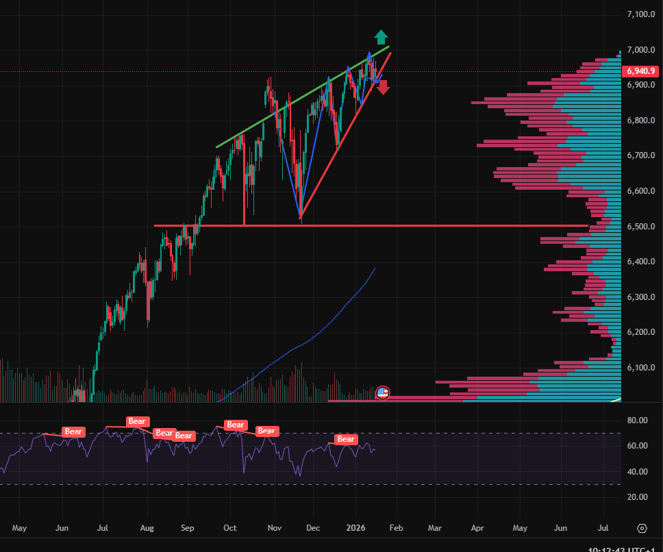
In such areas, distribution typically occurs. Large players gradually sell their positions, while smaller investors continue to buy in anticipation of further upside. On the surface, the market appears calm, but internally the structure of ownership is changing.
Another warning signal is the presence of repeated divergences. Price makes new highs, but the strength of the move weakens. The market continues to rise, but with each move it does so with less energy. This is a classic sign of a late stage trend.
The overall picture is completed by the rising wedge formation. Price moves higher, but within an increasingly narrow range. Such a structure often appears near market tops and historically ends more often with a move lower than with a continuation of the advance.
The combination of distribution within a volume zone, divergences, and a rising wedge does not create the image of a strong market. It creates the image of a market held together more by inertia than by genuine demand.
Note: This article is for informational purposes only and does not constitute investment advice. Investing in financial markets involves risk, and it is important to conduct your own analysis before making any investment decisions.